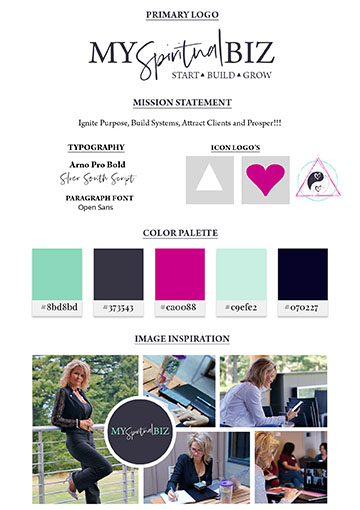
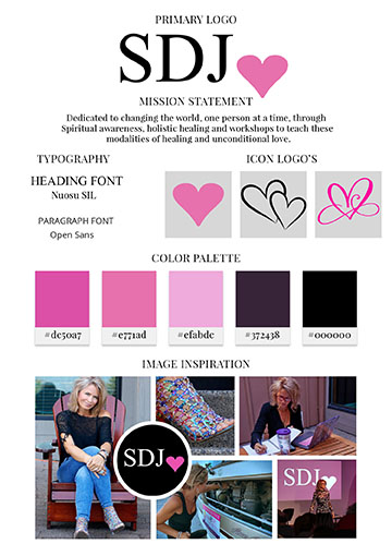
A brand board is an at-a-glance document containing all your brand elements- from your main logo to your color palette.
A brand is your vision, your purpose and your visuals all combined together.
Fonts, colors, spacing, patterns, and graphical elements make our brands come to life. All of these pieces come together in a brand board.
Other elements to enhance your brand board include:
- Alternative logos or watermarks
- Styled photography
- Signature patterns
- Graphic elements (icons, buttons, illustrations etc.)
- Taglines
Quick Tip: The number one thing to think about when creating your branding guide is to think about where your brand lives. Will you have a website? An Instagram? PDF documents? Business cards? Letterheads? Bumper stickers? Billboards? Presentations? What are the most important materials you use for marketing and everyday business?
6 Steps to Creating Your Brand Board
1. Gather inspiration
Browse through Pinterest
2. Choose your color palette.
After selecting photos for your moodboard, it becomes easy to select 2-5 colors for your color palette.
Adobe color – https://color.adobe.com/create/color-wheel
ColorSpace – https://mycolor.space/
Canva – https://www.canva.com/learn/100-color-combinations/
https://www.canva.com/learn/build-brand-mood-board/
3. Research and design your logo.
Brainstorm what you would like your logo to look like. Ask yourself the following questions:
- What represents my brand?
- Would I like my logo to be text-based or include some graphics?
- What is the most important thing my logo communicates?
- What are the key values being portrayed in my logo?
- Where will my logo be used? How many versions or alternative logos do I need?
While there is a lot that goes into building a logo, your logo is the centerpiece of your brand board. Everything flows from your logo—your colors, fonts, graphics, etc. Be patient with designing your logo, go through several different versions, and get feedback from others. Sleep on it before making a decision.
4. Choose complementary fonts.
While choosing fonts and colors will overlap with designing your logo, you can also select additional fonts that will be used with your other brand materials (website, business cards, brochures, stationery, etc.). Select a basic serif or sans-serif font to be used as body text that’s readable and appealing to the eyes. You can then spice it up with some script or display fonts. My suggestion is to keep your font selection to less than three fonts in order to maintain consistency.
5. Create patterns, icons and other graphical elements.
Patterns and icons are great for adding to your brand story. These are extensions of your brand visuals and should complement your logo and the vibe from your branding so far. Consider using these patterns as backgrounds for your web design, part of your business cards or on other graphical layouts for social media.
6. Bring them all together into a brand board.
After you have created your branding elements, open a new document to create a brand board. Organize these elements in a grid, with your logo in a featured spot. From there, you can add your font names and the hex codes for your color palette. This way, it is easy to know what your select colors and fonts are at all times. Many designers choose to label sections such as, “fonts,” “colors,” “watermark,” “style,” “logo,” etc., but this is optional. Go with what works for you!
